
Editing In the Era of AI: How to Keep Photographs Real
Why Real Photographs Matter More Than Ever
I’m not known for my editing. That’s the point.
There are photographers whose style is built in post, and I respect that but that’s not what I’m trying to do .
A few years ago, you had to earn an image. You woke up at four in the morning, drove into the desert, waited for the light, and hoped you'd read the weather right.
That's still true. But now there's a shortcut.
Anyone with a laptop can generate a photograph that will make your jaw drop. It isn't real, but it's convincing enough that most people won't notice. And the truth is, a lot of people don't care.
Even the tools photographers use are leaning hard into AI. They make it easier than ever to change what was actually there. And the more we rely on them, the less truth there is left in the photograph.
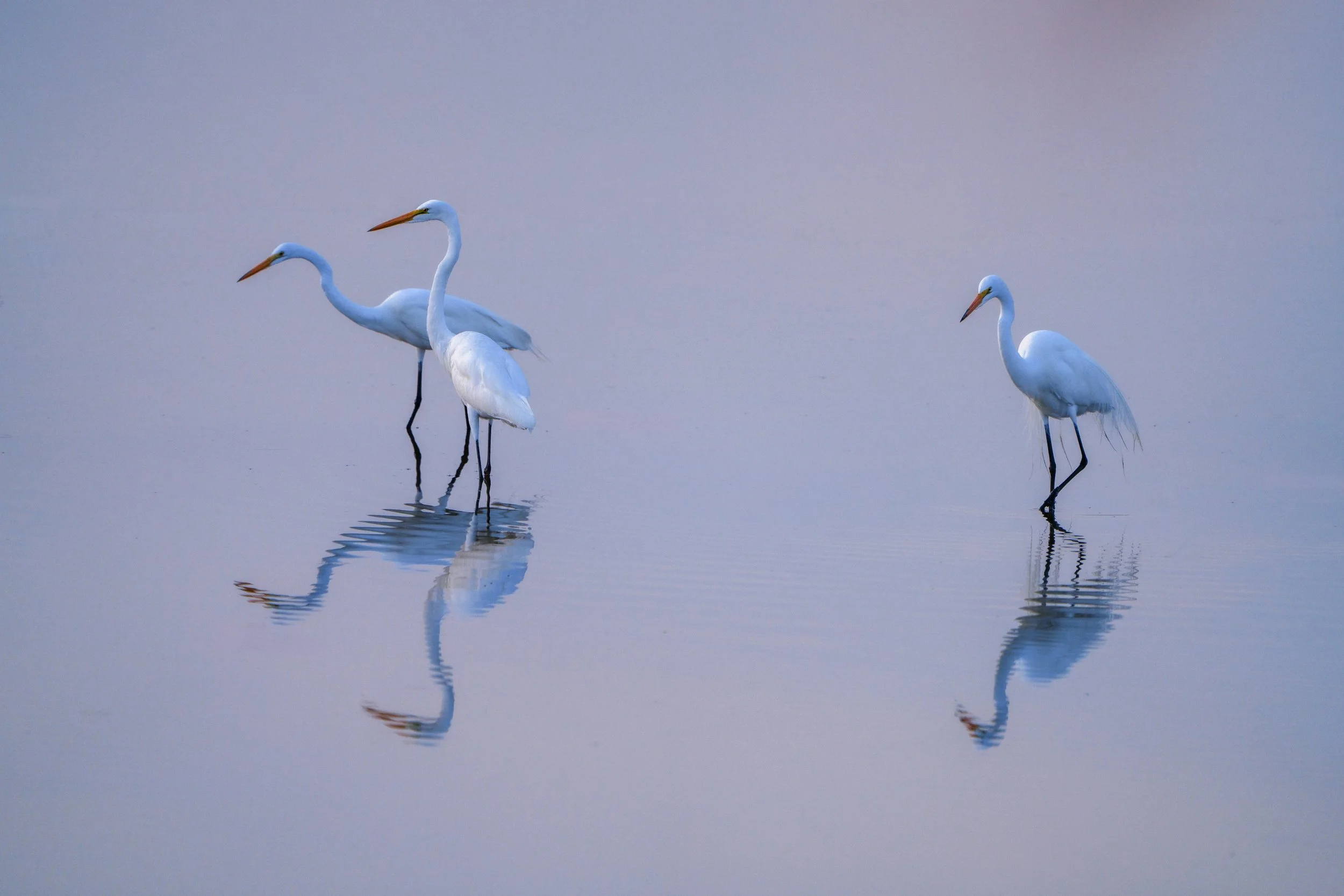
Egrets in an Estuary at Sunset near Cabo.
What I Look for Before I Edit
I've been published in National Geographic, Vogue, and Sports Illustrated Swim. My work has hung in the Denver Museum of Art and sold at Christie's auctions. Those clients came to me for one reason: the images were real.
Not pushed toward a trend. Not over-enhanced. Not composited into something they weren't.
My workflow is built on that. Reality first. Editing second.
Smooth Tonal Transitions
I look for smooth tonal transitions in both skin and landscape. Highlights should roll into midtones, and midtones into shadows without breaking apart.
But not every image should be soft. Some frames want to be harsh. Some want to be silhouettes. The mistake is forcing an image into something it wasn't.
Adding contrast to a flat image looks artificial. Trying to "fix" a silhouette defeats the point. The photograph already tells you what it wants to be.

Color, Memory, and Perception
Color isn't about technical accuracy unless you’re doing product photography, or something that requires perfect rendition of it. In most photography It's about memory, how it looked and felt standing there.
The goal is that someone standing next to me would recognize that moment completely. Not because it's neutral, but because it's honest to the light that was there.
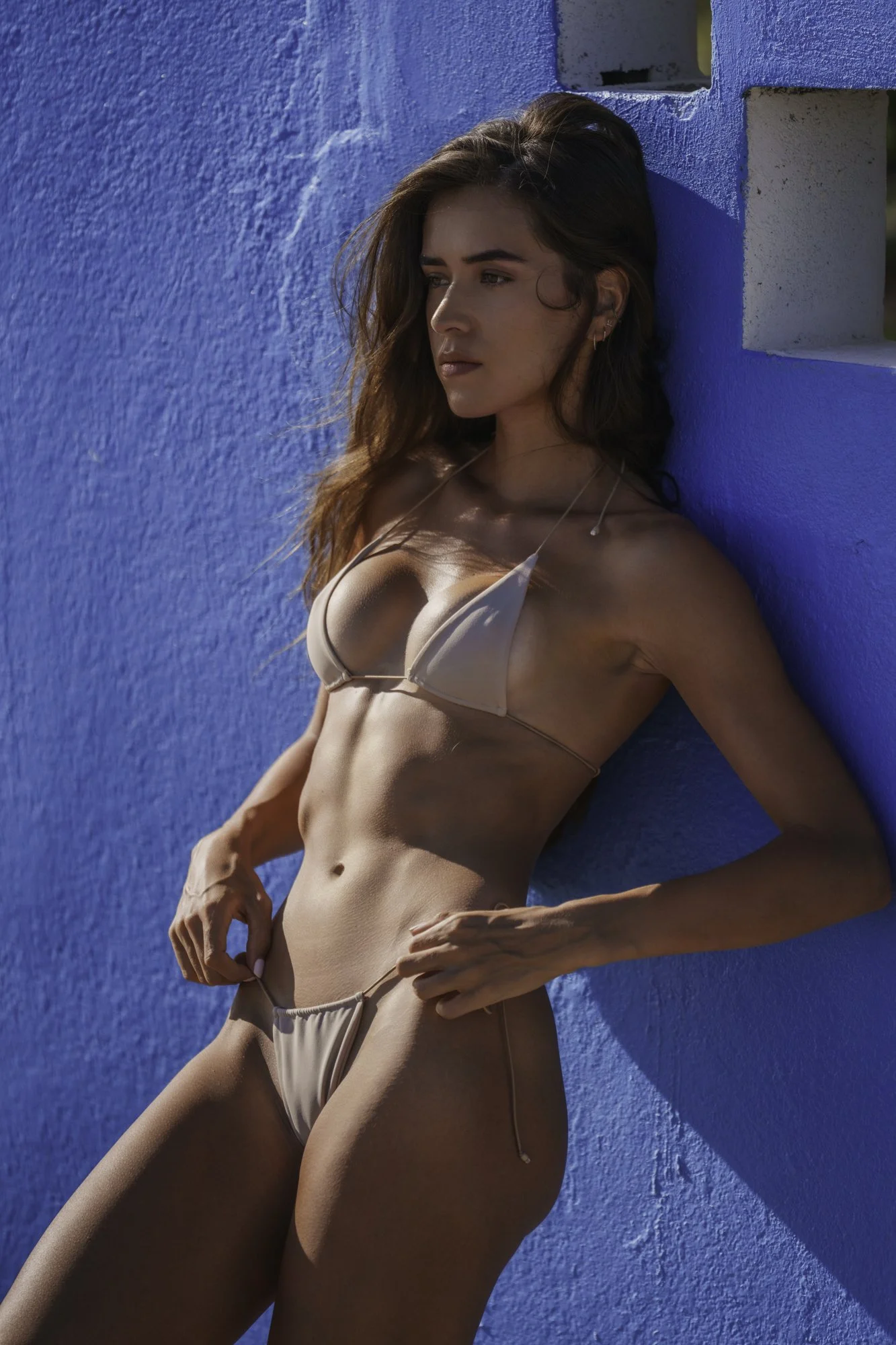
Chloe in Baja
Why Natural Skin Matters in Photography
Skin needs to look like skin. The moment you over-smooth it, make it “perfect”, the image stops feeling real, we disassociate from the person in the picture and view them as a commercial prop. Texture matters. Small wrinkles matter. Variation matters. It’s what makes us see the person as a human.
I remove distractions. I refine. But I don't erase the surface of a person. That's where authenticity disappears.
Lightroom Filters Don’t Work
What actually works is a process. A sequence of small decisions based on what the image really is.
I built that process over my career, and it’s what I use on every frame. What might take someone hours now takes me minutes. The steps are simple, repeatable, and consistent. They’ve allowed me to develop a recognizable style while still letting each image be its own.
You can play with tones, contrast, etc… But minimal changes end up feeling huge. I barely touched this image, but there is a distict feeling of a “style”.
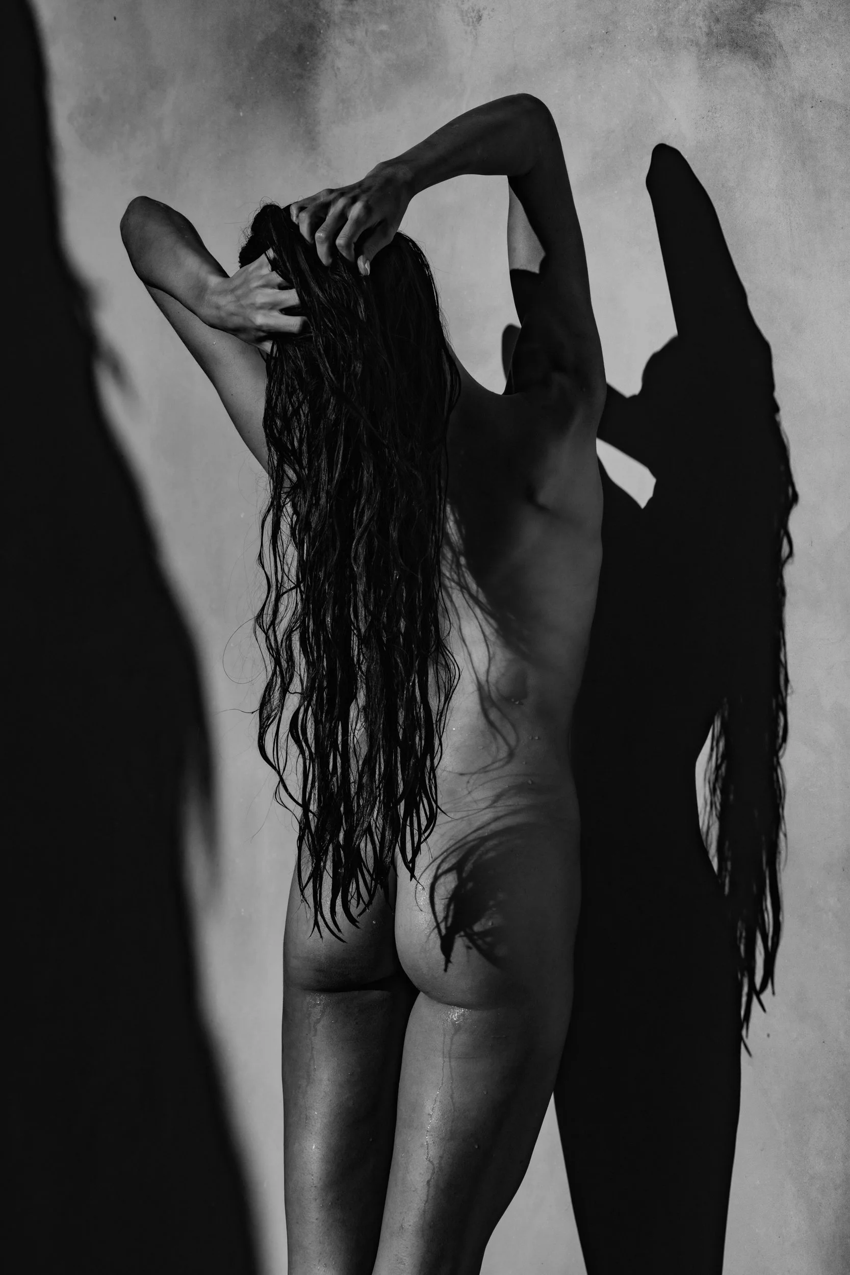
Black and White as Interpretation
Black and white is where I allow myself more freedom. Even in film, black and white has always been more flexible. You can push it, pull it, and shape the tonal range in ways that would feel unnatural in color. The darkroom was never about strict accuracy; it was about interpretation.
But black and white isn’t a way to fix a bad image. It doesn’t make a weak photograph strong.
It removes color so the image has to stand on structure, light, and moment alone. It forces the photograph to work without relying on color to carry it.
Proper use of grain doesn’t stand out, it blends the image together.
Film look vs Digital: What People Get Wrong
A lot of what people call a film look is just a reduction in quality. That’s backwards.
Film isn’t low quality. It’s different. A well-shot medium format negative holds an enormous amount of information. What people respond to isn’t degradation, it’s texture. Tonal range, smooth transitions in focus, tone and texture. It’s actually quite the opposite of what most filters do to your image.
Grain isn’t there to fake film. It’s there to break up the precision of digital pixels, which can feel clinical. It introduces variability back into the image, and that reads as natural.
A Professional Lightroom Workflow for Real Images
This approach isn't for everyone. If you prefer heavy grading or stylized edits, it won't appeal to you. If you're chasing attention in a feed, it won't help you. If you love editing, this isn’t going to be your vibe.
But if you care about what was actually there, like I do…. Then this is for you.
In a world where anything can be generated, the photograph that looks real becomes the valuable one. And knowing when to stop is the whole craft.
I've distilled this into a six-stage Lightroom workflow and I’ve decided to share it..
Thirty-two presets options applied in 6 steps. sequence. A complete workflow guide PDF that walks through each stage. The exact system I use on every frame, from National Geographic assignments to Sports Illustrated campaigns to fine art work meant for prints.
It's $29. Instant download. Mac and PC.